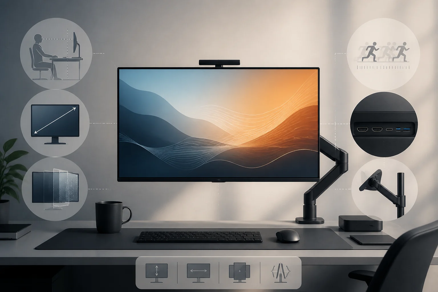
1) Size, resolution and distance: the trifecta that defines usable sharpness
Resolution alone doesn’t determine how sharp or comfortable a monitor will look. What you perceive at the desk depends on how physical screen size, pixel count and your seating distance come together. At equal resolution, a larger panel spreads the same pixels over more surface area; at equal size, a higher resolution packs more detail per inch. The third element—viewing distance—changes the subtended angle and therefore legibility and the effective workspace without scaling. Improving one factor without weighing the others usually creates a new limit: for example, jumping to 4K on 27 inches but then using heavy scaling that cancels the supposed “extra space.”
A practical way to decide: define your typical distance (for instance, 60–80 cm on home desks) and target the apparent density that feels comfortable for text. Many users find QHD (2560×1440) at 27 inches works with little or no scaling; 4K at 27 inches usually calls for 125–150% scaling, which preserves crispness but won’t increase workspace as much. If you sit farther away or prefer larger icons, a 32‑inch 4K offers more generous letter sizes without losing detail, while for compact desks a 24–25‑inch 1080p or 1440p can balance density and ergonomics. The goal isn’t chasing the “maximum” figure but picking the combination that minimizes visual strain and avoids extreme scaling that undercuts the advantages of higher resolution.
Also consider aspect ratio and how it translates into usable area. A 16:9 is versatile for most tasks, while 16:10 adds extra height for documents and code without excessive width. Ultra‑wide 21:9 or 32:9 displays can replace dual‑monitor setups and improve workspace continuity, but they require more desk width and an appropriate distance so the edges don’t sit outside your comfortable focus zone. In all cases, aim for an apparent size of fonts and icons that is readable without eye strain and without relying on drastic scaling that negates the benefit of higher pixel counts.
2) Panel technologies: IPS, VA, OLED and variants
Each panel technology brings strengths and trade‑offs that shift by use case. Modern IPS panels deliver consistent color and wide viewing angles, suiting varied content and non‑critical color work. VA panels stand out with higher native contrast—deeper blacks—which favors cinema and dark games, at the cost of somewhat narrower angles and, in some models, slower gray transitions. OLED and QD‑OLED reach near‑absolute black and very fast response times, with a risk of image retention/burn‑in mitigated by protection routines and, at times, lower full‑screen brightness than their small‑window peaks.
In current lineups you’ll see labels like “Fast IPS,” “Rapid IPS,” or “QD‑OLED.” These aren’t universal, standardized categories but marketing terms pointing to IPS panels tuned for faster response, and to OLED enhanced with quantum‑dot layers for higher color volume. For careful spec reading, focus on comparable metrics: gamut coverage (sRGB/DCI‑P3), uniformity, native contrast and—if motion matters to you—gray‑to‑gray (GtG) response and overdrive behavior.
Beyond core technology, surface finish (matte vs. glossy), black uniformity in dark rooms and each type’s typical artifacts matter. IPS commonly shows IPS glow—a lighter haze at extreme angles—that varies by unit; VA can exhibit black smearing in dark transitions when overdrive isn’t well tuned; OLED uses ABL algorithms limiting total brightness to protect the panel, so large white areas may not reach the same level as small‑window peaks. None of these effects invalidates a technology, but weigh them against your priorities and the environment in which you’ll use the monitor.
3) Refresh rate and response time: clear motion without artifacts
Refresh rate increases how many frames per second the panel can display. Moving from 60 Hz to 120/144 Hz smooths scrolling and reduces perceived blur, useful not only in games but also in window animations and text scrolling. However, real‑world fluidity depends on the entire chain: your GPU/SoC must render enough fps, and the panel must transition between tones quickly and without excessive overdrive that causes inverse ghosting. Support for adaptive sync technologies (Adaptive‑Sync/FreeSync/G‑SYNC Compatible) helps match the monitor’s refresh to the GPU’s fps within a useful range, reducing tearing and stutter.
When comparing options, look at the adaptive‑sync “active range” (e.g., 48–144 Hz) and input latency alongside the headline Hz figure. A 240 Hz display may add little if your system rarely exceeds 120 fps or if the panel’s GtG is slow. Conversely, a solid 144 Hz with well‑tuned response and a wide VRR range delivers a more consistent experience across different titles and everyday tasks.
Another practical point is how each manufacturer implements overdrive across refresh rates. Some monitors dynamically adjust overdrive with VRR to minimize smearing and coronas throughout the range; others force you to pick a mode that might be optimal at max refresh yet produce artifacts at lower rates. If you value motion clarity for reading or editing, explore features like BFI/ULMB or backlight strobing where available: these can boost perceived sharpness in motion, at the cost of brightness and, for some viewers, visible flicker.
4) Color, calibration and HDR: what really matters
For color‑sensitive work and entertainment, review coverage and accuracy: 99–100% sRGB is sufficient for most web content and office use; high DCI‑P3 (≈95–99%) and low delta E appeal to creators who need wider gamuts. Even with solid coverage, basic calibration (including vendor ICC profiles) improves consistency across apps. Remember that effective bit depth, panel uniformity and brightness stability matter as much as the advertised gamut percentage.
Working in wide spaces like DCI‑P3 with content mastered for sRGB can cause perceptible oversaturation. That’s why well‑implemented, locked sRGB modes are valuable, as is software‑level saturation control when fidelity is essential in mixed workflows. If you switch tasks often, favor clear OSD menus and consistent picture presets so you can toggle modes quickly without re‑tuning every parameter.
In HDR, badges matter—but so does how they translate in practice. VESA DisplayHDR 400 requires a limited brightness threshold and doesn’t imply local dimming; it usually delivers “basic compatibility” rather than a cinematic punch. For convincing HDR on LCD, look for local dimming (FALD or mini‑LED) and higher certifications (600/1000) paired with strong native contrast. On OLED, perfect blacks and “True Black 400/500” certification can produce more perceptible HDR even with lower full‑screen nits. Don’t buy by logo alone: check panel type, dimming method and sustained brightness figures. Also consider that content and OS handling matter—a good HDR implementation in software and games is as decisive as the monitor’s hardware capability.
5) Ergonomics: posture, fatigue and long‑term health
A good monitor shouldn’t just look good—it should fit you well. Ensure adjustable height, tilt, swivel and, if you need it, pivot to portrait. VESA arms free desk space and align multiple displays, letting you set the top bezel at eye level and keep elbows and wrists in neutral postures. For long sessions, set brightness and contrast to match your room, take regular breaks, and avoid glare with thoughtful placement and finish choices.
If you work many hours, prioritize a stand or arm that makes frequent micro‑adjustments easy. Poor ergonomics will lock in neck tension and eye fatigue even with the best panel. Think about your desk’s total width and the depth needed for your target distance; an ultrawide can force neck turns if it’s too close or poorly curved for your visual span.
Also assess visual‑comfort factors such as PWM behavior in the backlight—to reduce potential flicker discomfort—well‑tuned low blue light modes that preserve balance without heavy color cast, and the quality of anti‑glare treatment. Some very matte coatings diffuse reflections but can reduce perceived contrast; others, more satin‑like, better preserve micro‑contrast at the cost of stronger reflections under point lights. Adapting the environment (lamp position, curtains, screen orientation) usually yields more benefit than relying solely on coating.
6) Connectivity and features: make your system “speak” fluently
Verify that your outputs and cables support the resolution, refresh and features you want. DisplayPort and HDMI aren’t equivalent: depending on the version on your PC/laptop/console, access to 1440p/240 Hz, 4K/120–144 Hz, VRR and HDR at full color depth can vary. A common mistake is to buy a capable monitor and then connect it through a port/cable that limits you to 4K60 or disables VRR. If you care about KVM, USB‑C with charging, PIP/PBP or speakers, check which ports enable them and at what bandwidths.
To fully leverage consoles, confirm 120 Hz, VRR and HDR over HDMI; for PC, DP is often more flexible at high rates. If you’ll switch between multiple systems, an integrated KVM or at least a stable USB hub simplifies workflow. Avoid betting on proprietary features when mixing brands; favor recognizable standards (VESA Adaptive‑Sync, DisplayHDR, USB‑IF for USB‑C/PD).
If you’re considering USB‑C, check the stated power delivery and whether DP Alt Mode over USB‑C sustains your desired resolution and refresh alongside hub data. In some designs, high power delivery coexists with limits on video bandwidth or the number of active USB ports. It’s also helpful to confirm whether the monitor remembers per‑input configurations (e.g., different color presets or overdrive for HDMI vs. DP) and whether firmware is updatable to fix device compatibility or improve VRR behavior.
7) Example configurations: how to read a spec sheet without falling for traps
A 27‑inch IPS QHD monitor with 144 Hz, near‑99% sRGB coverage and Adaptive‑Sync is often a “sweet spot” for mixed use: crisp text at typical desk distances, perceptible smoothness and consistent colors without demanding an extreme GPU. If marketing touts 1 ms GtG, look for footnotes on the test condition (often an overdrive mode that introduces artifacts). If you see DisplayHDR 400, think “basic HDR”; value the panel’s real contrast more—and if it’s OLED, the “True Black” certification.
For specific profiles: competitive players will prioritize 240 Hz or higher, but with a useful VRR range and balanced response time; creators will look for high DCI‑P3 coverage and uniformity, perhaps opting for 32‑inch 4K for timeline space; movie lovers will value high contrast (VA or OLED) and strong black control. In all cases, remember the guide’s principle: optimize the whole—size, distance, density, motion, color, ports and ergonomics—and you’ll avoid the next bottleneck waiting on your desk.
When reading spec sheets, interpret numbers in context. A shiny 27" 4K may not boost productivity if you end up at high scaling; a 240 Hz model with a theoretical fast GtG can show coronas if aggressive overdrive is required to hit that number; an entry‑level HDR badge can improve small highlights but won’t transform full scenes without effective dimming. Always cross‑check specs with reviews that measure uniformity, real response times across refresh rates, and VRR behavior. Your goal isn’t to collect maximums but to build the balance that fits your space, habits and hardware best.