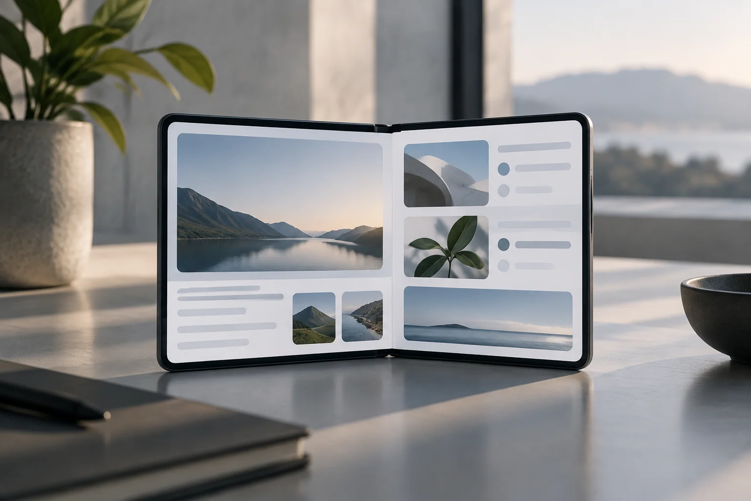
The important change is the format, not a promise of universal compatibility
The Galaxy Z Fold8 was introduced on July 22, 2026. In its developer guide published that same day, Google highlights a feature with a direct impact on software: the phone introduces an ultra-wide main display whose natural orientation is landscape. The recommendation is not to add a special version for one particular model, but to move away from rigid assumptions about orientation and aspect ratios. In other words, developers are being asked to consider how an app behaves across changing screen configurations, rather than treating a device’s familiar portrait layout as the only possible starting point. (Android Developers Blog)
Samsung describes the Fold8 as having a 4:3 main display that can be rotated for reading, and a 10:16 cover display. That creates two distinct contexts for the same app: a narrow outer area and a wider inner surface. The available information supports describing this as a new design challenge; by itself, it does not show that all apps will work poorly or that every app needs a complete rebuild. The practical question is how an existing interface responds when the user moves between those two areas, and whether its content and controls can accommodate the space actually available. The display specifications explain why developers need to consider more than one layout, but they are not evidence of a universal compatibility problem. (Samsung Newsroom)
Design for the app’s available space first
Google advises that an interface should respond to the available width first and then take height into account. In a wide window, it may be useful to show more columns, panels, or content at once; when space becomes narrower, those elements can be rearranged, resized, or moved into a different layout. The key is allowing the design to redistribute itself instead of depending on fixed coordinates or dimensions. That approach does not require every screen to show the same amount of information. It means that the arrangement can change in a deliberate way as the app’s window changes, so that controls and content remain usable rather than simply being squeezed into a layout designed for another shape. (Android Developers Blog)
It is also important to distinguish the physical size of the display from the space occupied by the app window. In split-screen or other multitasking modes, an app may receive only part of the panel, and its window may even have a different orientation from the device. Google points to Window Size Classes and Jetpack WindowManager as tools for identifying that actual space and window features. The interface can then respond to the conditions it is really given, rather than relying on an assumption based on the phone’s total screen size. For a user, this distinction matters because a large display does not mean that every app always has the whole display available. Window size, orientation, and the way the user arranges apps all affect the space in which the interface must work. (Android Developers Blog)
Folds, posture changes, and continuity
On a foldable, switching between closed and open changes the configuration received by the app. Android’s adaptive recommendations call for accounting for those states as well as portrait and landscape orientations, multi-window mode, and user preferences. For layouts that cross the hinge area, Jetpack WindowManager provides information about folds and hinges: an app can avoid placing important content there or use the area as a divider between panels. This makes the hinge a layout consideration, not merely a physical detail. The right choice depends on the interface: content can be kept clear of the fold, or separate parts of the app can be arranged on either side where that makes sense. (Android Developers)
Google also recommends preserving interface state during these changes, for example with ViewModel, so users do not lose context when unfolding or folding the device. This is a development guideline, not a description of what every installed app does automatically. In practical terms, when the display configuration changes, the current task, selection, or reading position should be retained where the app supports it. The quality of that continuity depends on how each application is built. A foldable can change the available layout without the user intending to start over; a well-prepared app should therefore consider what information needs to survive that transition. The recommendation does not establish that all apps currently preserve state, and it does not mean the platform can supply missing continuity on behalf of an app. (Android Developers Blog)
Android 17 removes an escape route for large-screen apps, but does not redesign their interfaces
Android 17 introduces a significant change for apps targeting API level 37: the option to opt out of Android’s rules that ignore orientation, aspect-ratio, and resizability restrictions on large screens at least 600 dp wide is no longer available. Google explains that these rules were first introduced in Android 16 for apps targeting API level 36 or higher. The change affects how an app responds to window size and orientation; it does not create an adaptive interface by itself. Put simply, the system may no longer honor certain restrictions in the same way for the apps covered by the rule, but that behavior is separate from the work required to arrange the app’s content well. (Android Developers)
That is why it is useful to distinguish a system rule from design work. Android may allow an app to be resized or shown in an orientation different from the one it previously enforced, but it will not magically rearrange buttons, lists, or panels to make them comfortable to use. Google’s documentation offers, as a temporary practice, a strategy that restricts portrait mode on compact screens and allows the user’s orientation on screens of 600 dp or more. The guide itself presents this as a limited step, not a replacement for full support. Developers still need to consider how the interface looks and behaves in the configurations the system permits. The change in platform behavior can expose weak layouts, but it should not be mistaken for an automatic redesign or a guarantee that every control will land in a suitable place. (Android Developers)
Camera: another adaptation test, separate from the general interface
Google’s guide treats camera capture separately. When moving from a compact outer display to a larger inner one, the proportions of the preview area change even if the device’s orientation does not necessarily change. An implementation that assumes a fixed relationship between the sensor and the display can end up showing a preview that is rotated, distorted, or cropped. Google recommends CameraX for new implementations and mentions PreviewView as a way to help manage sensor orientation, rotation, and scaling. This is a specific example of why a single interface check may not be enough: camera preview has its own geometry and needs to respond to the surface where it is shown. (Android Developers Blog)
For existing projects that use Camera2, the same post points to CameraViewfinder as an alternative for applying aspect-ratio and rotation transformations without rebuilding the entire architecture. These are recommendations for people developing or maintaining apps; they do not imply that the system can correct every camera-software problem in third-party apps. When evaluating a camera app on a foldable, it is therefore worth observing the framing and the transition between displays, rather than inferring complete compatibility just because the app opens. A working launch is only one visible sign. The preview may still respond poorly to the change in available area, and the cited development tools are recommendations rather than a promise that an app already uses them. (Android Developers Blog)
What users can check, and where the limits are
For users, a useful check is to open an app on the cover display, unfold the phone, rotate it, and, if the app allows it, try split-screen. Pay attention to whether content rearranges, whether bars or empty areas appear, whether controls remain accessible, and whether the task continues after the change. In reading, video, or camera apps, it also matters whether the content format and preview are unexpectedly cropped. These are observable signs, not a technical certification or the result of tests conducted for this article. Trying several configurations can reveal how an app behaves in ordinary use, but it cannot establish that the app supports every possible window size or posture. The check is useful precisely because it focuses on visible behavior without claiming more than that behavior can show.
Google’s announcement is guidance for developers and platform tools; it does not publish a compatibility audit of specific apps. Nor does it support the conclusion that the Galaxy Z Fold8 forces every app to be redesigned, or that Android 17 guarantees an optimal experience in all of them. The verifiable point is narrower: landscape-oriented form factors and variable windows make it more important to adapt an interface to the available space, and Android 17 limits an orientation exception for apps targeting API 37 or higher. The difference between accepting a configuration and designing well for it will continue to depend on each developer. Users can observe that difference, but the guidance itself does not certify the behavior of any particular application. (Android Developers Blog)