
What it means to make an Android app accessible
An accessible app lets people understand its content and complete its tasks across different sensory, motor and cognitive abilities, and with different assistive technologies. A tidy-looking screen is not enough: what a screen reader communicates, how someone moves through the interface, and whether an action can be completed without relying on just one way of interacting all matter. The aim is to keep essential flows usable with Android’s available display settings and assistive features. Accessibility is part of whether people can use the product, not a decorative layer added after the interface is finished.
Review the product as a complete experience, including controls, messages, forms, dialogs and screen transitions. An icon may make a button’s purpose obvious visually but fail to explain it to someone listening to the interface; a temporary notice may be missed if it is not announced, and an otherwise functional flow can become confusing if navigation order is illogical. Accessibility must be checked in the app’s actual behavior, not only in its code or a screenshot. Every state and task matters, including errors and confirmations, because they can determine whether a person can proceed independently.
Names, roles and states that communicate the interface
Every interactive element needs a name that describes its purpose or what happens when it is activated. In Android, content descriptions can provide that name, but they should describe what the element does rather than merely narrate what it looks like. A decorative icon beside an already labeled button does not need to repeat the same information. An icon that acts on its own does need to identify the action. A label should help someone decide what to do, rather than add redundant words such as “button” when the control’s role is communicated separately.
Role and state are also part of the message: they help distinguish an action from a control that can be switched on or off, for example. In Jetpack Compose, semantics properties help communicate meaning, type and state to accessibility services. Items in a list should be distinguishable by their content, not given the same generic description. To assess a label, listen to how it is announced and ask whether it identifies the element and lets someone anticipate its effect without looking at the screen. Concise descriptions are often more useful than lengthy explanations.
Navigation order, TalkBack and complete user flows
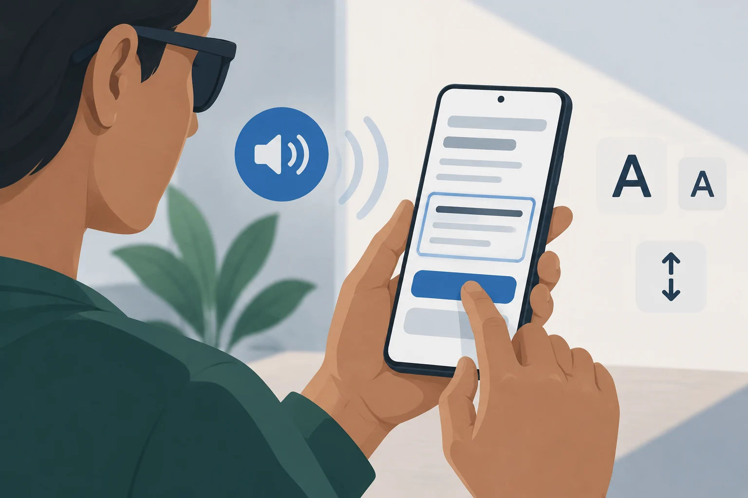
TalkBack is Android’s built-in screen reader. With TalkBack enabled, someone can move through an interface element by element using linear navigation, or explore different areas of the screen by touch. Each announcement should clearly convey an element’s content or purpose; notices and temporary messages that affect a task also need to reach someone using the screen reader. Announcing every control is not enough if the order makes the screen difficult to understand or a task hard to complete. The experience depends on how announcements and navigation work together.
Test common tasks from beginning to end: searching, completing a form, changing a setting and recovering from an error. Check that elements appear in an understandable sequence, actions have unambiguous names, and focus is not lost when the screen changes or a dialog appears. In Compose, the traversal order can be adjusted when the default does not provide a logical experience. If you change it, check the resulting sequence with TalkBack to make sure it follows the task’s logic, rather than merely copying the visual arrangement. A sensible order makes it easier to understand what comes next.
Text, contrast and touch targets
Text should remain legible when someone increases its size, without being clipped or hiding buttons, labels or instructions. Android recommends designing scalable content and checking how the interface responds to font-size and display-size settings. Review screens containing long text, forms and buttons: a layout that works at the default size may stop being operable as content grows. The design should adapt to the user’s setting, rather than require the person to return to a smaller size to finish a task. Check the whole screen, since text growth can affect surrounding controls as well as the text itself.
For text-to-background contrast, Android recommends a minimum ratio of 4.5:1 for text smaller than 18 sp and bold text smaller than 14 sp; for the other indicated cases, it recommends 3:1. It also recommends a touch target of at least 48 dp by 48 dp for each interactive element. These are Android design recommendations, not a guarantee of accessibility by themselves. Check each control’s name and whether its function can be used through suitable alternative interaction methods, as well as its touch-target size.
Compose, Views and where WCAG fits
Accessibility belongs in Android app development, whether the interface uses Views or Jetpack Compose. Compose provides semantics that represent the meaning of elements, and supports inspecting properties and adjusting traversal order. When creating custom controls, do not assume that their appearance automatically communicates their function. Check what information reaches accessibility services and whether the control behaves as people using the app would expect. The same principle applies when standard components are combined or changed: the resulting experience is what matters.
WCAG 2.2 is a W3C recommendation for web content and covers the use of that content on mobile devices. Its criteria can help guide a review of content and experience, but they do not automatically make a native app conformant or certified. The scope, context of use and applicable requirements depend on the case. For an Android app, combine relevant criteria with platform guidance and real interaction testing; do not present a partial check as a general statement of conformance. A framework can inform an assessment without replacing one tailored to the app and its use.
A testing plan that combines people and tools
Automated tests and analysis tools help find common problems, but they do not replace manual evaluation. Android recommends combining interaction with accessibility services, analysis tools, automated tests and evaluation with users. In Compose, interface checks can flag issues such as contrast or display at different sizes. Accessibility Scanner can also suggest improvements related to labels, interactive elements and contrast. An alert is a prompt to investigate, not a complete measure of the experience. A tool may identify a likely issue, while the effect on a real task still needs to be assessed.
For each important release, use a short checklist covering representative tasks and different interaction modes. Include a TalkBack review, check changes in text size, navigate controls using the alternative navigation method intended for the app, and complete essential flows. Record the screen, step and impact of each issue; prioritize problems that prevent someone from understanding an action or finishing a task. After addressing them, repeat the test and ask people with different access needs for feedback. A useful outcome is a task that can be completed, not merely a report with fewer findings.